animate_xy(c1)
animate_xy(c3)ETC3250: Tutorial 3 Help Sheet
Exercises
Question 1: Projection Matrix
Part A
Write a projection matrix which would generate a 2D projection where the first data projection has variables 1 and 4 combined equally, and the second data projection has variables 2 and 5 combined with variable 5 having greater weight.
Hint 1
Check week 2 lecture slides 26 to 31.
Hint 2
I would reccomend checking this page of the Cook and Laa textbook for the requirements of a projection matrix. Remember, matricies are just a simple way to describe a system of linear equations.
Hint 3
I would suggest writing the matrix that combines the variables correctly and then make sure it follows the gneeral requirements for a projection matrix. The projected data (\(Y\)) should have dimension 1 equally variable 1 and variable 4, that is to say \(Y_1 = X_1 + X_4\) and dimension 2 should be a third variable 2 and two thirds variable 5, that is \(Y_2 = \frac1 2 X_2 + X_5\). Write these equations in matrix form to get a starting point for your answer.
Hint 4
The matrix equation that represents that linear system above is:
\[\begin{align*} {\mathbf Y = \mathbf{XA}} = \left[\begin{array}{rrrrr} 2 & -2 & -8 & 6 & -7 \\ 6 & 6 & -4 & 9 & 6 \\ 5 & 4 & 3 & -7 & 8 \\ 1 & -7 & 6 & 7 & -1 \end{array}\right] \left[\begin{array}{rr} 1 & 0 \\ 0 & 1/2 \\ 0 & 0 \\ 1 & 0 \\ 0 & 1 \\ \end{array}\right] \end{align*}\]
This matrix has not been adjusted to fulfill the requirements of a projection matrix. If you are unsure how to convert this into a projection matrix, check the hints for Part B.
Part B
Why can’t the following matrix considered a projection matrix?
\[\begin{align*} {\mathbf A} = \left[\begin{array}{rr} -1/\sqrt{2} & 1/\sqrt{3} \\ 0 & 0 \\ 1/\sqrt{2} & 0 \\ 0 & \sqrt{2}/\sqrt{3} \\ \end{array}\right] \end{align*}\]
Harriet’s Comment
The way this question is set up implies that we are asking why \(\mathbf A\) can’t be a projection matrix for \(\mathbf X\), however that was not the intended question. Because of this implication, students often think the problem with this matrix is the dimensionality, (becuse the dimensions of \(\mathbf A\) and \(\mathbf X\) do not line up. This question is actually supposed to be asking about the validity of \(\mathbf A\) as a projection matrix in general, not specifically for \(\mathbf X\).
Hint 1
(same as Part A) Check week 2 lecture slides 26 to 31.
Hint 2
(same as Part A) I would recommend checking this page of the Cook and Laa textbook for the requirements of a projection matrix. Remember, matricies are just a simple way to describe a system of linear equations.
Hint 3
The requirements for any projection matrix are:
The projected data should be a 2D matrix with n observations. Therefore the projection matrix has a specific dimensionality according to the rules of matrix multiplication which can be found on the wiki page.
The projection matrix should be orthonormal which means each column should be orthonomal with the other columns in the matrix. Remember, a vector cannot be orthogonal to itself.
Hint 4
The requirements for any projection matrix are (more specifically):
Since the data is \(n \times p\) and the projected data needs to be needs to be \(n \times p\) the projection matrix should have the dimension \(p \times d\). In this case, \(d=2\)
Since \(d=2\) you only need to check each column is normalised (this will be two calculations) and the two columns are orthogonal to each other (this is just one calculation). A vector is normalised if it has a length of 1, i.e. \(\sqrt{a_{11}^2 + a_{12}^2 + ... + a_{1n}^2}=1\). Two vectors are orthogonal to each other if their dot product is 0. That is, for columns i and j (where \(i \neq j\)) they need to satisfy: \[a_i \cdot a_j = \sum_k^n(a_{ik} \times a_{jk}) = 0 \] If you are unfamiliar with summation notation, this is just: \[(a_{i1} \times a_{j1}) + (a_{i2} \times a_{j2}) + ... + (a_{in} \times a_{jn}) = 0\]
Question 2: Graph Theory
(Write down your answers, this is good exam practice)
Part A
Explain what is meant by plotting the ‘data-in-the-model-space’ and plotting the ‘model-in-the-data-space’
Hint 1
Check week 2 lecture slides 4 to 7.
Part B
Describe one advantage and one disadvantage of using a scatterplot matrix to visualise moderate to high dimensional data
Hint 1
Check week 2 lecture slides 9 to 12.
Part C
Describe one advantage and one disadvantage of using a parallel coordinates plot to visualise moderate to high dimensional data
Hint 1
Check week 2 lecture slides 14 to 20
Part D
(In the tutorial questions) is a screenshot taken from a tour of the penguins data. Which two variables are projected the most in this view of the data?
Hint 1
Check week 2 lecture slides 32 to 36.
Part E
Below is another screenshot taken from a tour of the penguins data. In this view of the tour we see evidence that there are at least two clusters in the data. Which variable appears to be driving the clustering structure that we see here the most?
Hint 1
Check week 2 lecture slides 32 to 36.
Question 3: Detecting Clusters
For the data sets, c1, c3 from the mulgar package, use the grand tour to view and try to identify structure (outliers, clusters, non-linear relationships).
Code to Generate Animation
Hint: Where to go for information
Check week 2 lecture slides 32 and 33 to get an idea of how to comment on the structures you see in tours.
Hint: Questions to consider
- How many clusters are there?
- How big are the clusters?
- How would you describe the shape of the clusters?
- How would you describe the overall shape of the data?
- How does the shape change as you move through different projections?
- Is there any statistical importance to some of the shapes you notice? (e.g. if the data can be projected into a straight line, what does that mean?)
Question 4: Effect of covariance
Examine 5D multivariate normal samples drawn from populations with a range of variance-covariance matrices. (You can use the mvtnorm package to do the sampling, for example.) Examine the data using a grand tour. What changes when you change the correlation from close to zero to close to 1? Can you see a difference between strong positive correlation and strong negative correlation?
Code to Generate Animation
library(mvtnorm)
set.seed(501)

s1 <- diag(5)
s2 <- diag(5)
s2[3,4] <- 0.7
s2[4,3] <- 0.7
s3 <- s2
s3[1,2] <- -0.7
s3[2,1] <- -0.7

s1
s2
s3

set.seed(1234)
d1 <- as.data.frame(rmvnorm(500, sigma = s1))
d2 <- as.data.frame(rmvnorm(500, sigma = s2))
d3 <- as.data.frame(rmvnorm(500, sigma = s3))

animate_xy(d1)
animate_xy(d2)
animate_xy(d3)
Hint: Where to go for information
Check week 2 lecture slides 32 and 33 to get an idea of how to comment on the structures you see in tours.
Hint: Questions to consider
- How does the shape of the data change as the correlation between the variables changes?
- How does this shape relate to the variance-covariance matrix?
- Look at the three variance-covariance matrices. Which variables have correlation in
s2ands3? What would you expect to happen when these variables are contributing to the projection?
Question 5: Principal components analysis on the simulated data
For data sets d2 and d3 what would you expect would be the number of PCs suggested by PCA?
Harriet’s Comment
The d2 and d3 data for this question is the same data used in the previous question (q3)
Hint: Where to go for information
Check week 2 lecture slides 40 to 54 to get an idea of how PCA works.
Hint: Compare to d1
Answering these questions might be easier if we think about what will happen with d1, then compare d2 to d1, and then compare d3 to d2.
What would the PCA on a dataset with 5 uncorrelated variables look like? How many dimensions are needed to capture the variance of these 5 variables? Does capturing the variance get easier or harder when you correlate the variables?
Hint: Number of PCs
We know that the PCA for d1, d2, and d3 will have 5 PCs simply because that is how many variables, but the question is moreso asking how many PCs will have “useful” information.
For d1, because there is no correlation, each variable needs to be captured separataly. You need one PC dimension to capture the variance in each of the 5 dimensions.
When you correlate two variables, you establish that those variables contain a lot of the same information and can be summarised together. That is, correlation should reduce the number of PCs requires to summarise the information in the data set.
Conduct the PCA. Report the variances (eigenvalues), and cumulative proportions of total variance, make a scree plot, and the PC coefficients.
Hint: Where to go for information
To conduct the PCA, check week 2 lecture slides 58 which calculates the PCA for an example. REMEMBER: All the columns in d2 and d3 are numeric with a mean of 0.
To report the variances, calculate how much of the variance is in the # of PCs you suggested in the previous part of this question.
Lecture 2 slide 50 and 52 will give you the formula for proportion of total variance and cumulative variance.
Lecture 2 slide 60 has a scree plot but the code is not shown. Try downloading the lecture qmd file to find the code that made the scree plot.
The PC coeffieicnets are shown in lecture 2 slides 58. They are what is provided when you calculate the PCA.
Hint: Suggestions for the code you need
Compute the PCA with prcomp(data)
If you name your prcomp, pca, you can get the proportion of variance explained for each PC using pca$sdev. Remember you total variance should be 5 due to standardisation.
Use mulgar::ggscree(pca, q=#variables) to make your scree plot
Often, the selected number of PCs are used in future work. For both d3 and d4, think about the pros and cons of using 4 PCs and 3 PCs, respectively.
Hint: An ideal solution
Based on the response you gave at the begining of this question, what do you think an ideal PC for d1, d2 and d3 would look like? How do the actual PCs differ from that solution? How does this impact the number of PCs you should use in your work?
Question 6: PCA on cross-currency time series
In Moodle, under Learning -> Getting Started you will find a data folder. Download this folder and you will it that contains the rates_Nov19_Mar20.csv data.
The rates.csv data has 152 currencies relative to the USD for the period of Nov 1, 2019 through to Mar 31, 2020. Treating the dates as variables, conduct a PCA to examine how the cross-currencies vary, focusing on this subset: ARS, AUD, BRL, CAD, CHF, CNY, EUR, FJD, GBP, IDR, INR, ISK, JPY, KRW, KZT, MXN, MYR, NZD, QAR, RUB, SEK, SGD, UYU, ZAR.
Part A
Standardise the currency columns to each have mean 0 and variance 1. Explain why this is necessary prior to doing the PCA or is it? Use this data to make a time series plot overlaying all of the cross-currencies.
Code to get data
rates <- read_csv("https://raw.githubusercontent.com/numbats/iml/master/data/rates_Nov19_Mar20.csv") |>
  select(date, ARS, AUD, BRL, CAD, CHF, CNY, EUR, FJD, GBP, IDR, INR, ISK, JPY, KRW, KZT, MXN, MYR, NZD, QAR, RUB, SEK, SGD, UYU, ZAR)
Code to standardise currency
library(plotly)
rates_std <- rates |>
  mutate_if(is.numeric, function(x) (x-mean(x))/sd(x))
rownames(rates_std) <- rates_std$date
p <- rates_std |>
  pivot_longer(cols=ARS:ZAR,
               names_to = "currency",
               values_to = "rate") |>
  ggplot(aes(x=date, y=rate,
             group=currency, label=currency)) +
    geom_line()
ggplotly(p, width=400, height=300)
Hint: Where to go for information (about whether we need to standardise).
Check lecture 2 slides 58 and read the code. Are the variables in that data set standardised before the PCA is calculated?
Hint: A little extra push
Setting scale=TRUE means we don’t need to standardise the variables for the computation of the PCA, however you should consider what will happen to the time series plot if we don’t standardise the variables beforehand.
Hint: Making the time series plot
A time series plot would require a ggplot() with x=date, y=rate, and group=currency. Consider using pivot_longer() to get your data in a form where it is easy to plot.
Part B
Conduct a PCA. Make a scree plot, and summarise proportion of the total variance. Summarise these values and the coefficients for the first five PCs, nicely.
Note
The following hints are identical to those in question 4 that are for the computation.
Hint: Where to go for information
To conduct the PCA, check week 2 lecture slides 58 which calculates the PCA for an example. REMEMBER: All the columns in d2 and d3 are numeric with a mean of 0.
To report the variances, calculate how much of the variance is in the # of PCs you suggested in the previous part of this question.
Lecture 2 slide 50 and 52 will give you the formula for proportion of total variance and cumulative variance.
Lecture 2 slide 60 has a scree plot but the code is not shown. Try downloading the lecture qmd file to find the code that made the scree plot.
The PC coeffieicnets are shown in lecture 2 slides 58. They are what is provided when you calculate the PCA.
Hint: Suggested functions to use
Compute the PCA with prcomp(data)
If you name your prcomp, pca, you can get the proportion of variance explained for each PC using pca$sdev.
Use mulgar::ggscree(pca, q=#variables) to make your scree plot
Code: Explicit code to do PCA and scree plot
rates_pca <- prcomp(rates_std[,-1], scale=FALSE)
mulgar::ggscree(rates_pca, q=24)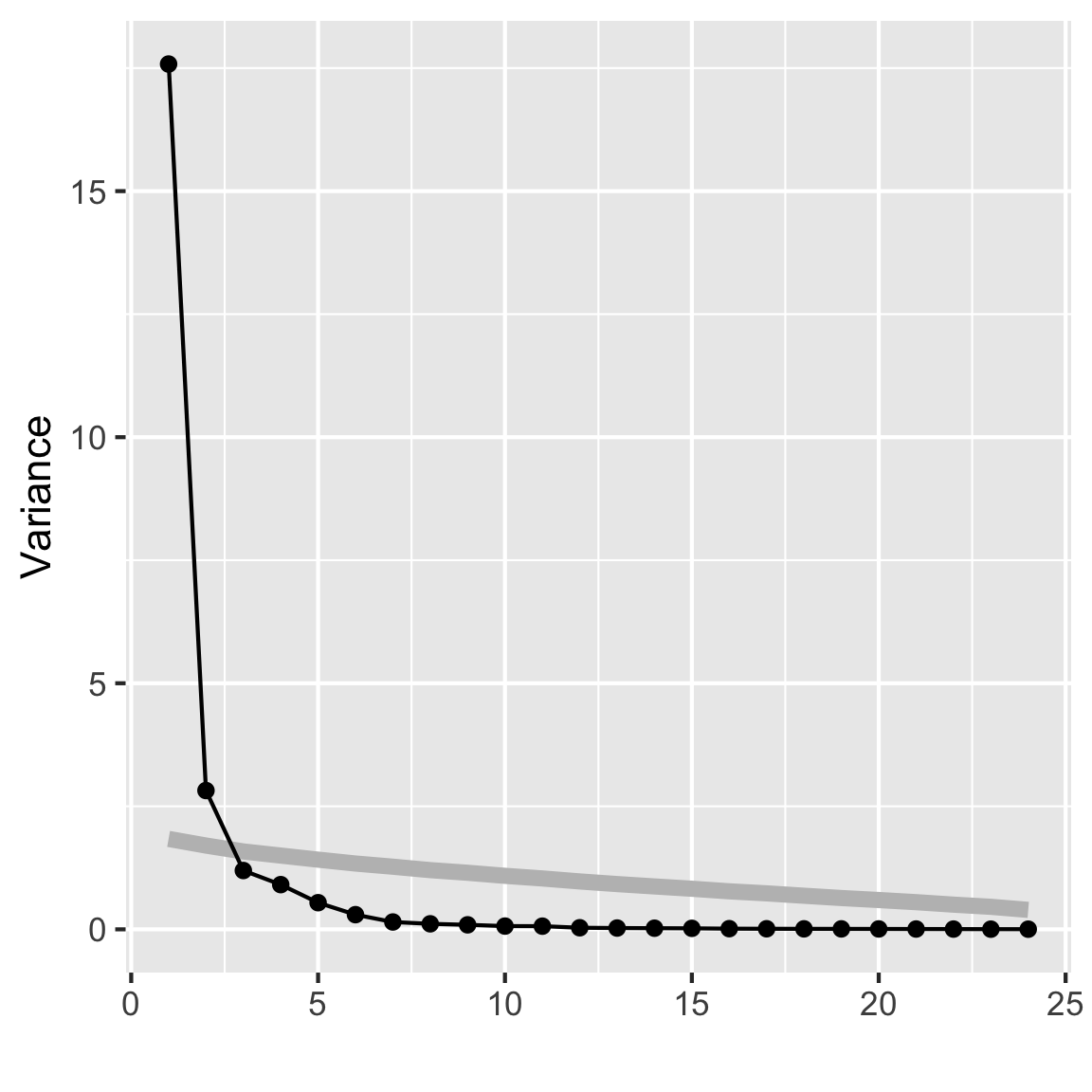
options(digits=2)
summary(rates_pca)
Importance of components:
PC1 PC2 PC3 PC4 PC5 PC6 PC7 PC8
Standard deviation 4.193 1.679 1.0932 0.9531 0.7358 0.5460 0.38600 0.33484
Proportion of Variance 0.733 0.118 0.0498 0.0379 0.0226 0.0124 0.00621 0.00467
Cumulative Proportion 0.733 0.850 0.8999 0.9377 0.9603 0.9727 0.97893 0.98360
PC9 PC10 PC11 PC12 PC13 PC14 PC15
Standard deviation 0.30254 0.25669 0.25391 0.17893 0.16189 0.15184 0.14260
Proportion of Variance 0.00381 0.00275 0.00269 0.00133 0.00109 0.00096 0.00085
Cumulative Proportion 0.98741 0.99016 0.99284 0.99418 0.99527 0.99623 0.99708
PC16 PC17 PC18 PC19 PC20 PC21 PC22
Standard deviation 0.11649 0.10691 0.09923 0.09519 0.08928 0.07987 0.07222
Proportion of Variance 0.00057 0.00048 0.00041 0.00038 0.00033 0.00027 0.00022
Cumulative Proportion 0.99764 0.99812 0.99853 0.99891 0.99924 0.99950 0.99972
PC23 PC24
Standard deviation 0.05985 0.05588
Proportion of Variance 0.00015 0.00013
Cumulative Proportion 0.99987 1.00000
Code: Explicit code to do the Summary
# Summarise the coefficients nicely
rates_pca_smry <- tibble(evl=rates_pca$sdev^2) |>
  mutate(p = evl/sum(evl),
         cum_p = cumsum(evl/sum(evl))) |>
  t() |>
  as.data.frame()
colnames(rates_pca_smry) <- colnames(rates_pca$rotation)
rates_pca_smry <- bind_rows(as.data.frame(rates_pca$rotation),
                            rates_pca_smry)
rownames(rates_pca_smry) <- c(rownames(rates_pca$rotation),
                              "Variance", "Proportion",
                              "Cum. prop")
rates_pca_smry[,1:5]
PC1 PC2 PC3 PC4 PC5
ARS 0.215 -0.121 0.19832 0.181 -0.2010
AUD 0.234 0.013 0.11466 0.018 0.0346
BRL 0.229 -0.108 0.10513 0.093 -0.0526
CAD 0.235 -0.025 -0.02659 -0.037 0.0337
CHF -0.065 0.505 -0.33521 -0.188 -0.0047
CNY 0.144 0.237 -0.45337 -0.238 -0.5131
EUR 0.088 0.495 0.24474 0.245 -0.1416
FJD 0.234 0.055 0.04470 0.028 0.0330
GBP 0.219 0.116 -0.00915 -0.073 0.3059
IDR 0.218 -0.022 -0.24905 -0.117 0.2362
INR 0.223 -0.147 -0.00734 -0.014 0.0279
ISK 0.230 -0.016 0.10979 0.093 0.1295
JPY -0.022 0.515 0.14722 0.234 0.3388
KRW 0.214 0.063 0.17488 0.059 -0.3404
KZT 0.217 0.013 -0.23244 -0.119 0.3304
MXN 0.229 -0.059 -0.13804 -0.102 0.2048
MYR 0.227 0.040 -0.13970 -0.115 -0.2009
NZD 0.230 0.061 0.04289 -0.056 -0.0354
QAR -0.013 0.111 0.55283 -0.807 0.0078
RUB 0.233 -0.102 -0.05863 -0.042 0.0063
SEK 0.205 0.240 0.07570 0.085 0.0982
SGD 0.227 0.057 0.14225 0.115 -0.2424
UYU 0.231 -0.101 0.00064 -0.053 0.0957
ZAR 0.232 -0.070 -0.00328 0.042 -0.0443
Variance 17.582 2.820 1.19502 0.908 0.5413
Proportion 0.733 0.118 0.04979 0.038 0.0226
Cum. prop 0.733 0.850 0.89989 0.938 0.9603Part C
Make a biplot of the first two PCs. Explain what you learn.
Hint: coding suggestions
Lecture 2 slide 61 has a biplot but the code is not shown. Try downloading the lecture qmd file to find the code that made the scree plot.
Code: Explicit code to do the biplot
library(ggfortify)
autoplot(rates_pca, loadings = TRUE,
loadings.label = TRUE) 
Hint: Questions to consider
- Is there any noticeable shape? Does that shape make sense given what you know about biplots?
- Which variables contribute to PC1? What about PC2?
- Given which countries contribute to each PC, is there any real world effect that you think the data is picking up on?
Part D
Make a time series plot of PC1 and PC2. Explain why this is useful to do for this data.
Code: Explicit code to do the two time series plots
rates_pca$x |>
  as.data.frame() |>
  mutate(date = rates_std$date) |>
  ggplot(aes(x=date, y=PC1)) + geom_line()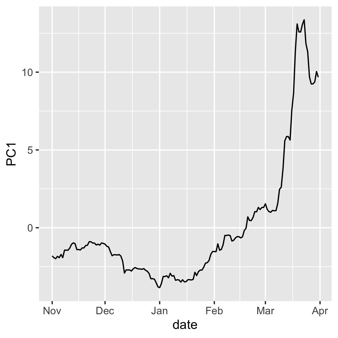
rates_pca$x |>
  as.data.frame() |>
  mutate(date = rates_std$date) |>
  ggplot(aes(x=date, y=PC2)) + geom_line()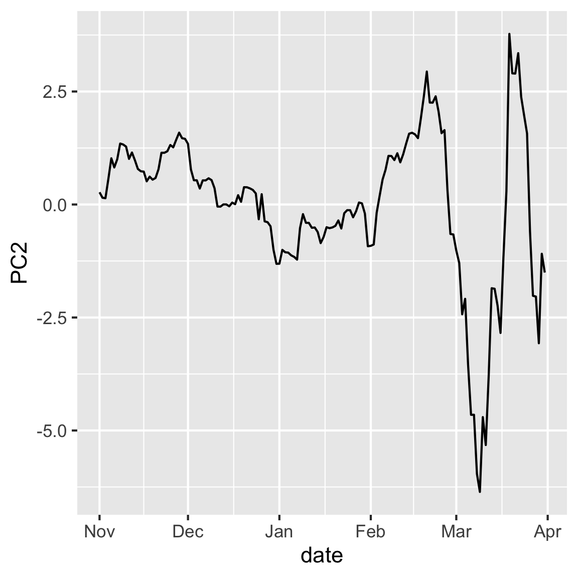
Hint: Considerations for why you might use this plot
- Is there any inherent structure in the observation in this case? How might that structure impact your interpretation of the PCs?
- Do you notice any patterns in the data when you plot them according to your PCs?
- These values are relative to the USD, are the patterns in the data expected given the currencies that contributed to each PC?
Part E
You’ll want to drill down deeper to understand what the PCA tells us about the movement of the various currencies, relative to the USD, over the volatile period of the COVID pandemic. Plot the first two PCs again, but connect the dots in order of time. Make it interactive with plotly, where the dates are the labels. What does following the dates tell us about the variation captured in the first two principal components?
Code: Explicit code to do the interactive biplot
library(plotly)
p2 <- rates_pca$x |>
  as.data.frame() |>
  mutate(date = rates_std$date) |>
  ggplot(aes(x=PC1, y=PC2, label=date)) +
    geom_point() +
    geom_path()
ggplotly(p2, width=400, height=400)
Hint: Considerations for why you might use this plot
- Are the PCs related to time? What time periods cause changes in the pattern?
- Try to think about real world events that correlate with the dates that you have in your pattern.
Question 7
Write a simple question about the week’s material and test your neighbour, or your tutor.